Skjálfti 2025
Client:
Rafíþróttasamband Íslands
Project Details
Owner
Release date
Services
Duration
After almost twenty years, Iceland’s biggest LAN tournament made its return. Skjálfti had not been held since 2002, and for its revival in 2025, Rafíþróttasamband Íslands brought me in to lead the branding, hype-video production, social media design and overall creative direction. The goal was to reconnect with the nostalgia surrounding the original event while giving it the clarity and energy expected from modern esports. I created a refreshed identity that pairs bold typography with a contemporary color system and atmospheric visuals inspired by topographic and seismic patterns.
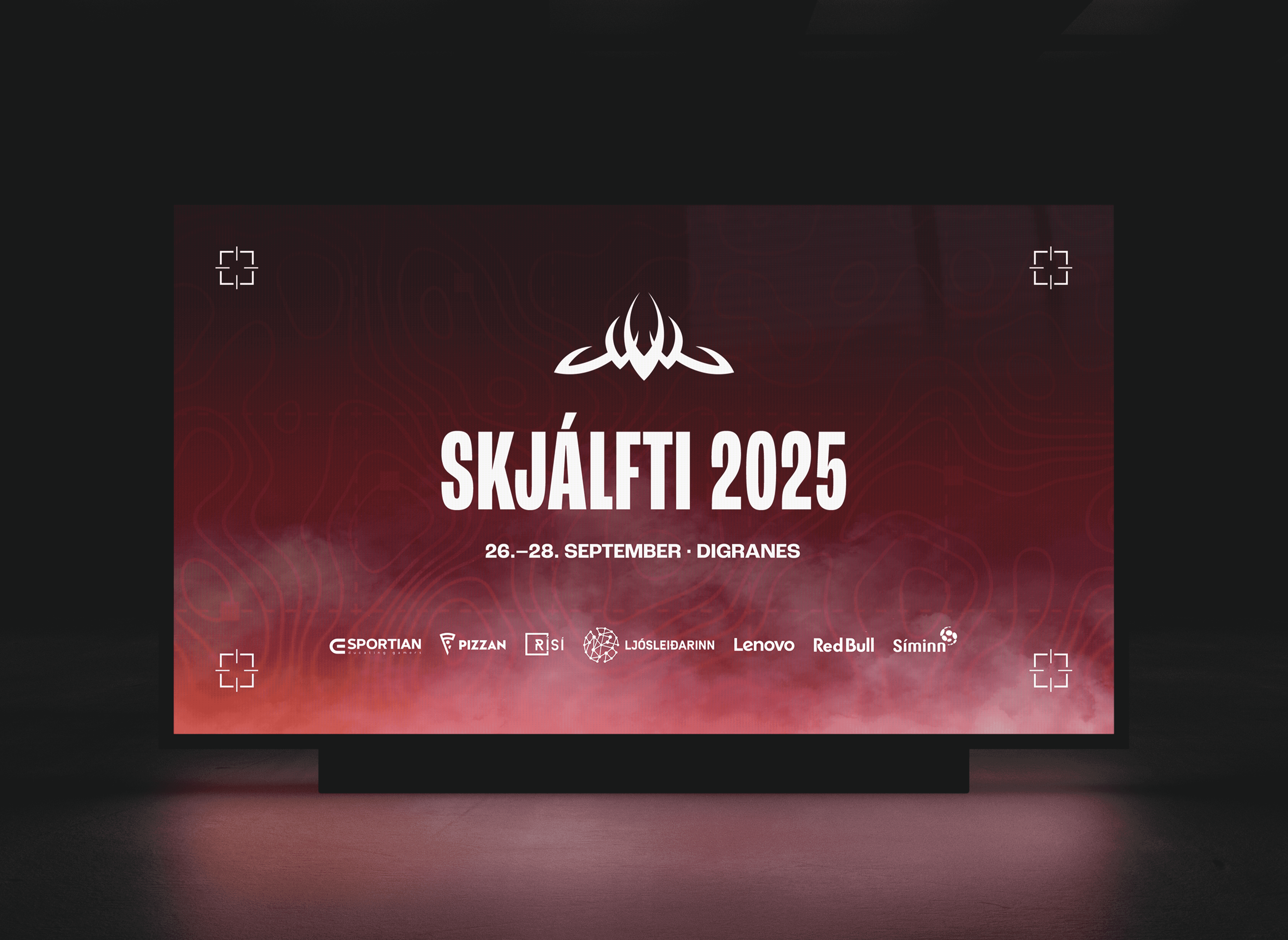
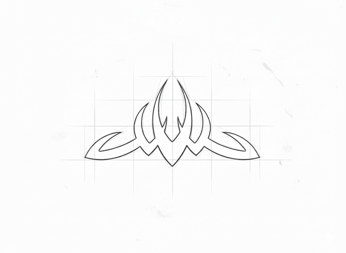
In the absence of any surviving source files, the original Skjálfti logo only existed as a low-resolution image found on an archived Icelandic forum. To maintain historical continuity for the brand’s 2025 revival, I manually rebuilt the logo from scratch, using the reference image as guidance. The result preserves the spirit of the original mark while giving it the precision and flexibility needed for modern use.
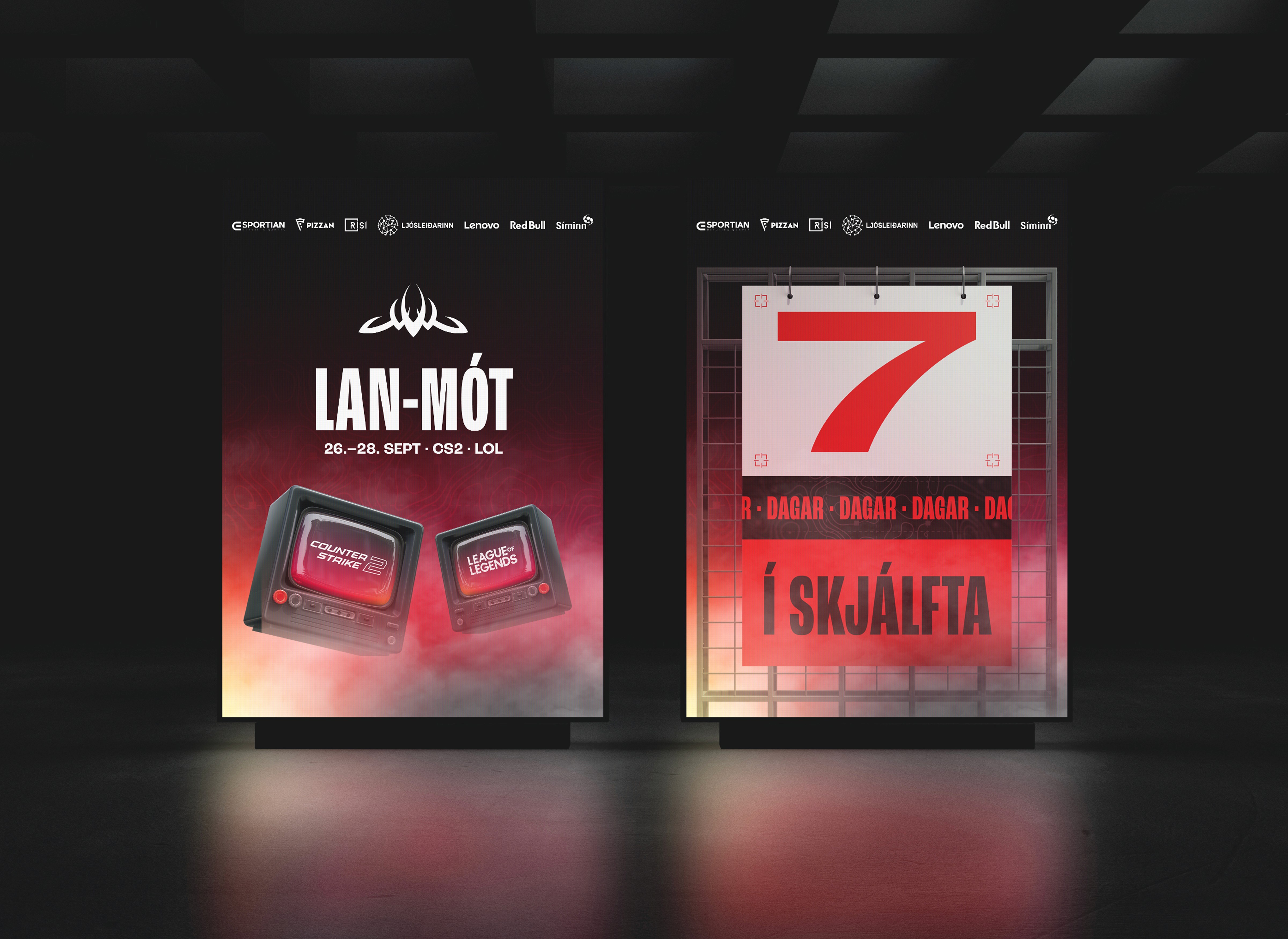
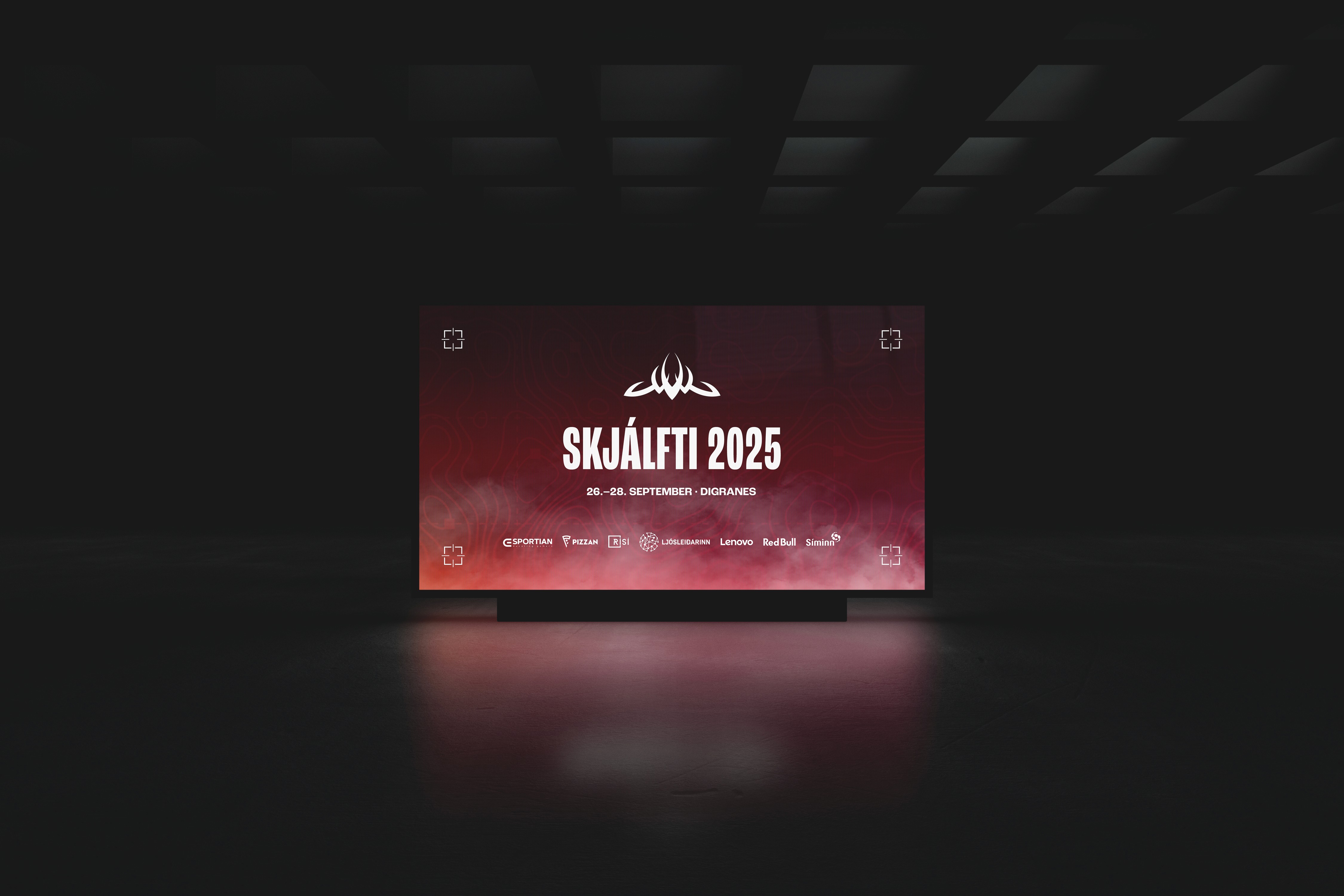
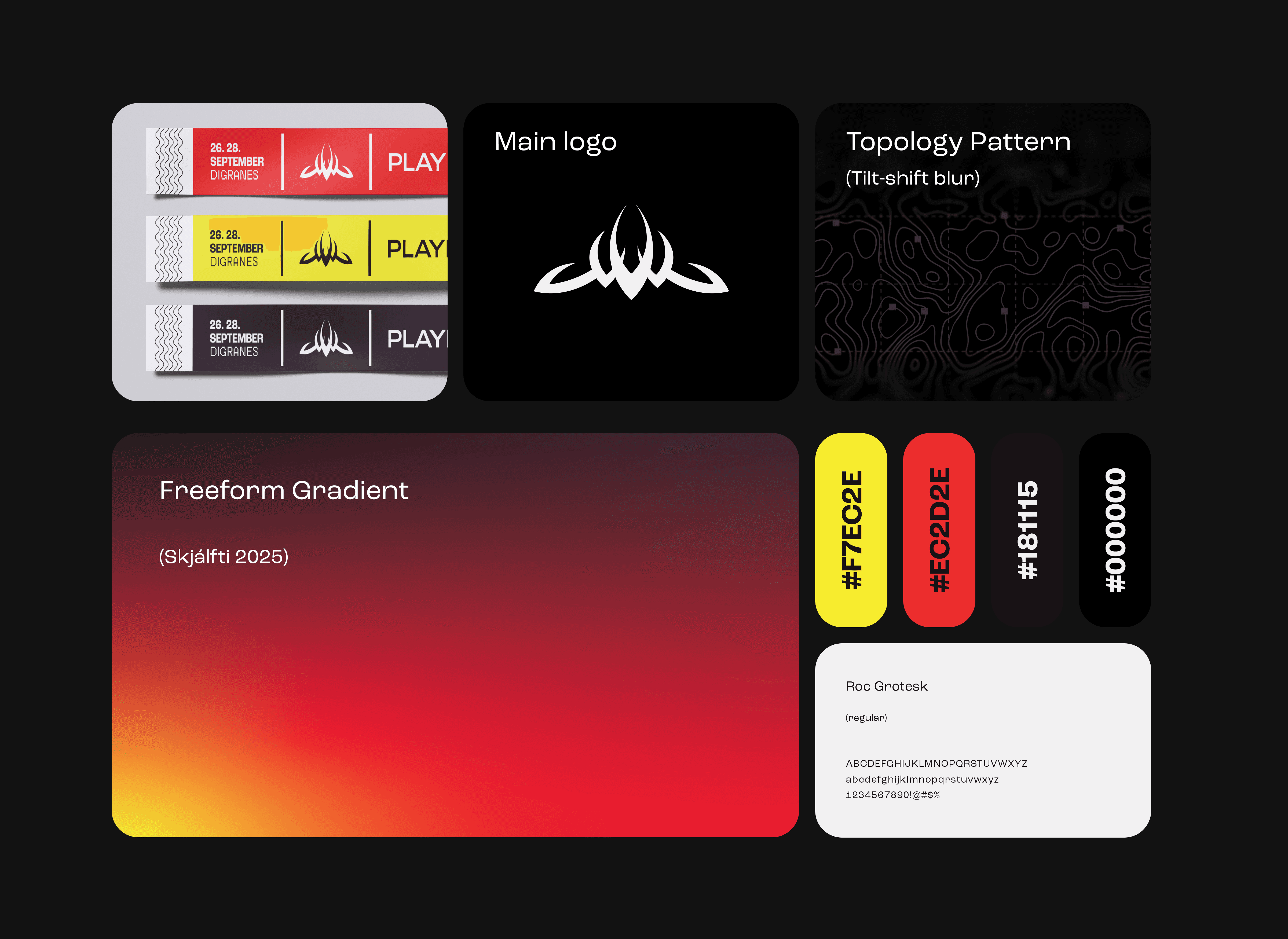
For Skjálfti, I created a modular visual system built around the restored logo, a topographic pattern, a bold color palette and a freeform gradient inspired by volcanic heat. These elements work together in a bento-style layout that scales across digital and physical touchpoints. A clear color-coded structure defines each game category, making tournaments and access levels instantly readable.
The social media campaign was designed to build anticipation in the weeks leading up to the event. Each graphic used the new color system, the restored Skjálfti symbol and atmospheric fog to create a consistent tone across platforms. Short countdown posts, game announcements and sponsor highlights were all built around the same visual language so the identity stayed instantly recognizable. The mockups shown here represent how the campaign translated onto digital signage and event spaces. The goal was to create visuals that felt energetic and modern while staying true to Skjálfti’s roots. This unified approach helped establish a strong presence online and ensured that every touchpoint, from Instagram posts to on-site screens, felt connected to the broader identity.